Round 1
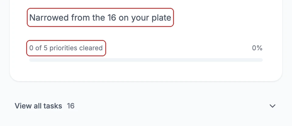
"Why are these two numbers different?"
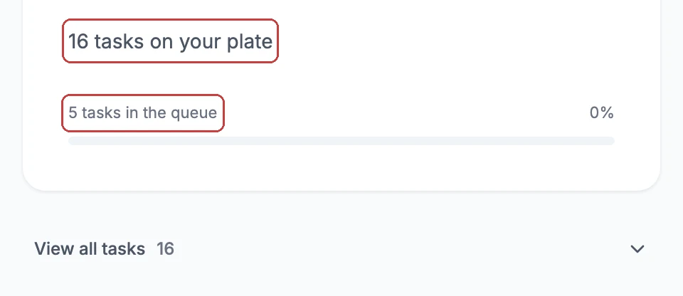
Before"5 in the queue" next to "16 in the list" read as a bug.
After"Narrowed from the 16 on your plate." The narrowing became the point.
Product design case study · Web app · Shipped prototype
A decision-support web app that decides what's next, so you don't have to.
It steps in when a workday stops being manageable.
It reduces cognitive overload.
Demo login: sam / focus
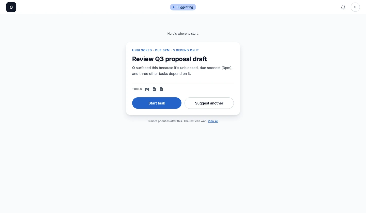
Concept to deployed prototype
Production tools


A focus tool that works by hiding your work.
Every task tool answers overload with more visibility. The research pointed the other way.
The problem
When work arrives from every direction at once, capable people lose time to one thing: Choosing what to do next. It isn't a discipline problem. Under enough pressure, the tool meant to help and the mind meant to choose give out at the same time.
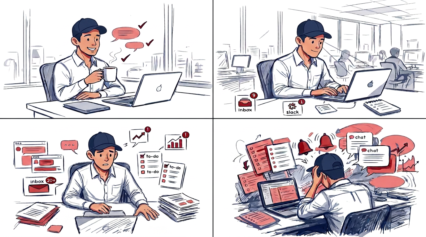
"When I hit peak overload, having a view of all my tasks overwhelms me more."Interview participant
What popular task tools show at that moment:
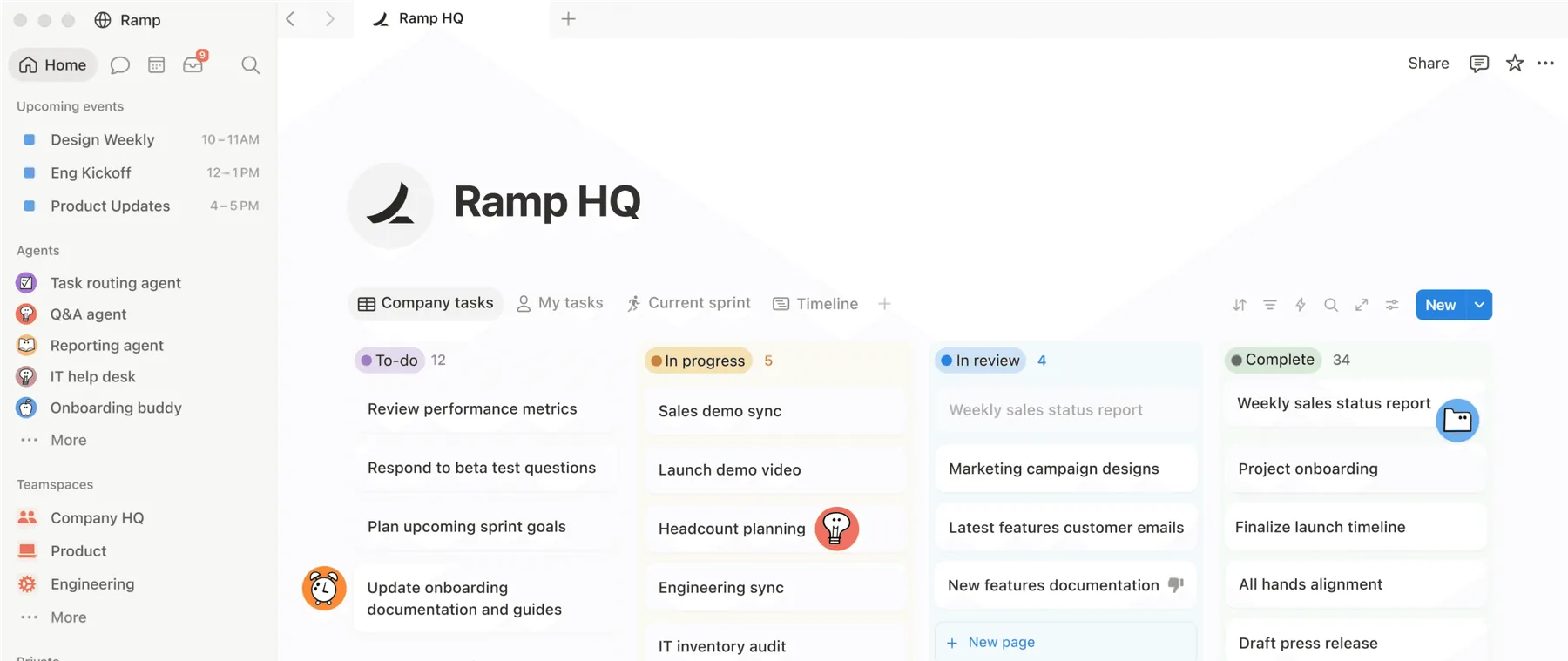
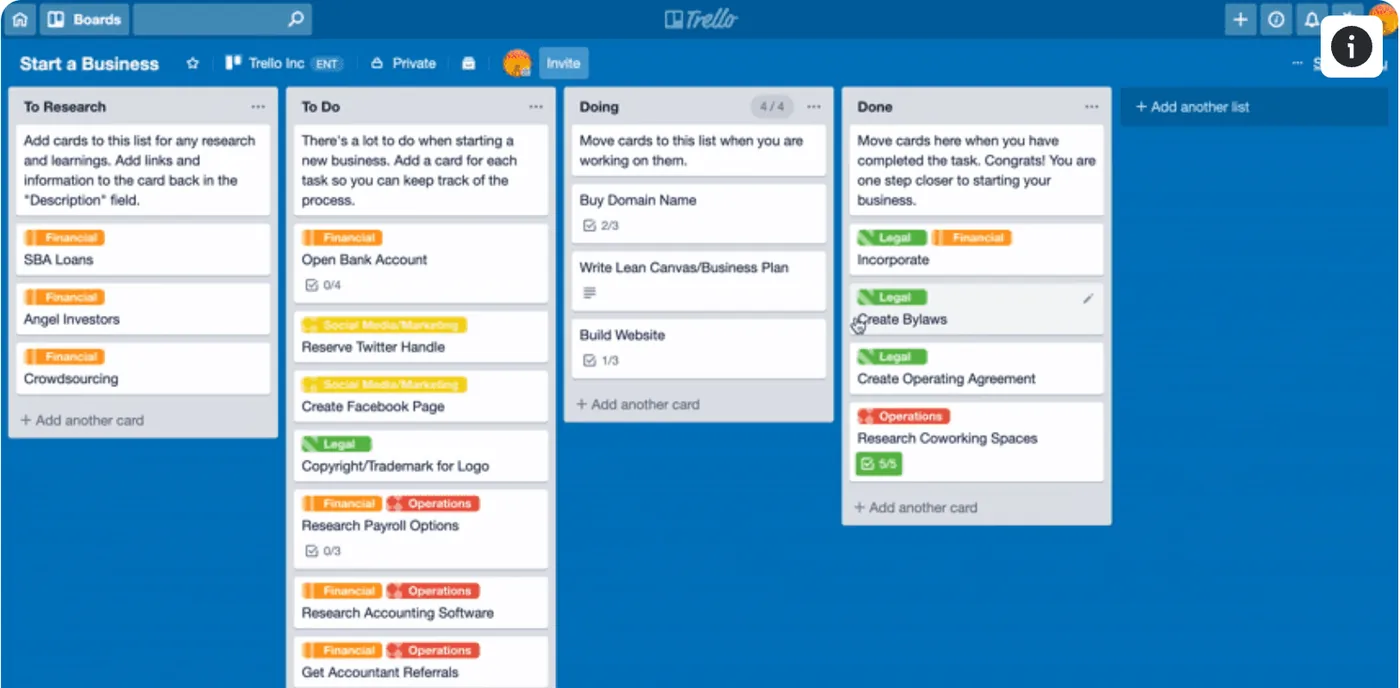
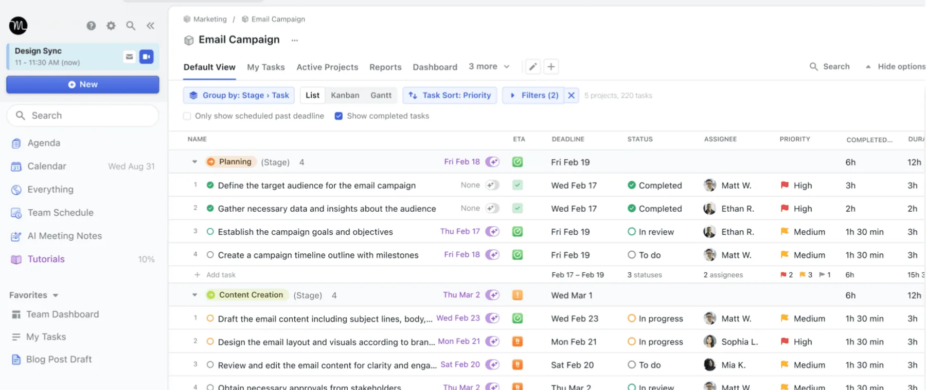
More visibility is the answer most tools give. At peak pressure, it's the wrong one.
What research found
Four professionals walked me through a real workday. Productivity forums showed hundreds more describing the same breakdown as it happened. The two groups started in different places and broke down in the same order.
Nobody quit their tool because it lacked a feature. They quit to stop seeing the list.
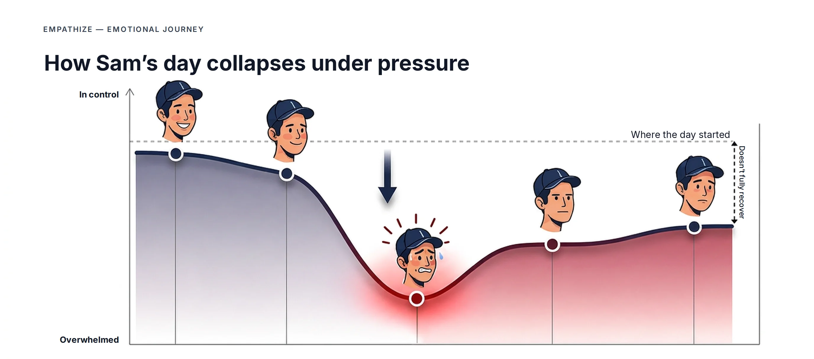 Intervention needs to step in here, before the low point
The productivity bottleneck isn't workload or features.
It's decision paralysis under pressure.
HMW
How might we help professionals decide what to do next when cognitive load peaks?
The question every design decision below was tested against.
The solution
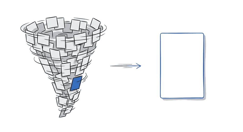
Q models the natural defence mechanism against overwhelm: It cuts the noise and locks onto one task. But unlike a stressed mind, Q stays sharp — prioritising your most urgent work based on three concrete criteria.
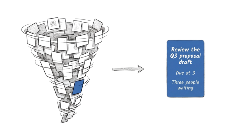
Q never takes control: The full list stays one click away. And it picks with three plain rules, not AI — can I start it now, is it due soonest, are others waiting — so anyone can check the pick at a glance.
Try it: Twelve tasks, one decision
The prototype's real task list. Switch Q on, then ask for a different pick.
Here’s where to start.
How Q shows up
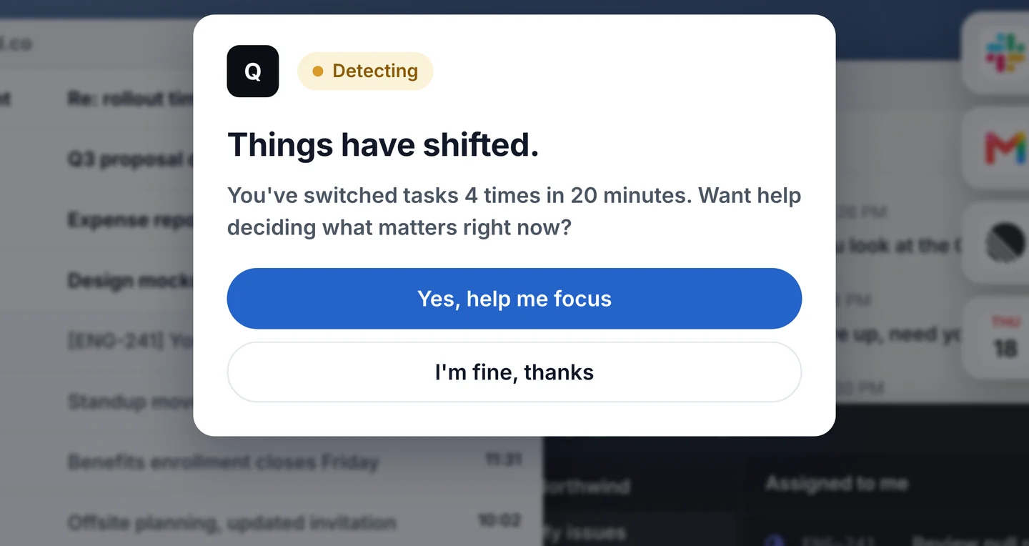
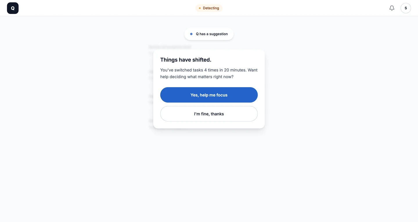
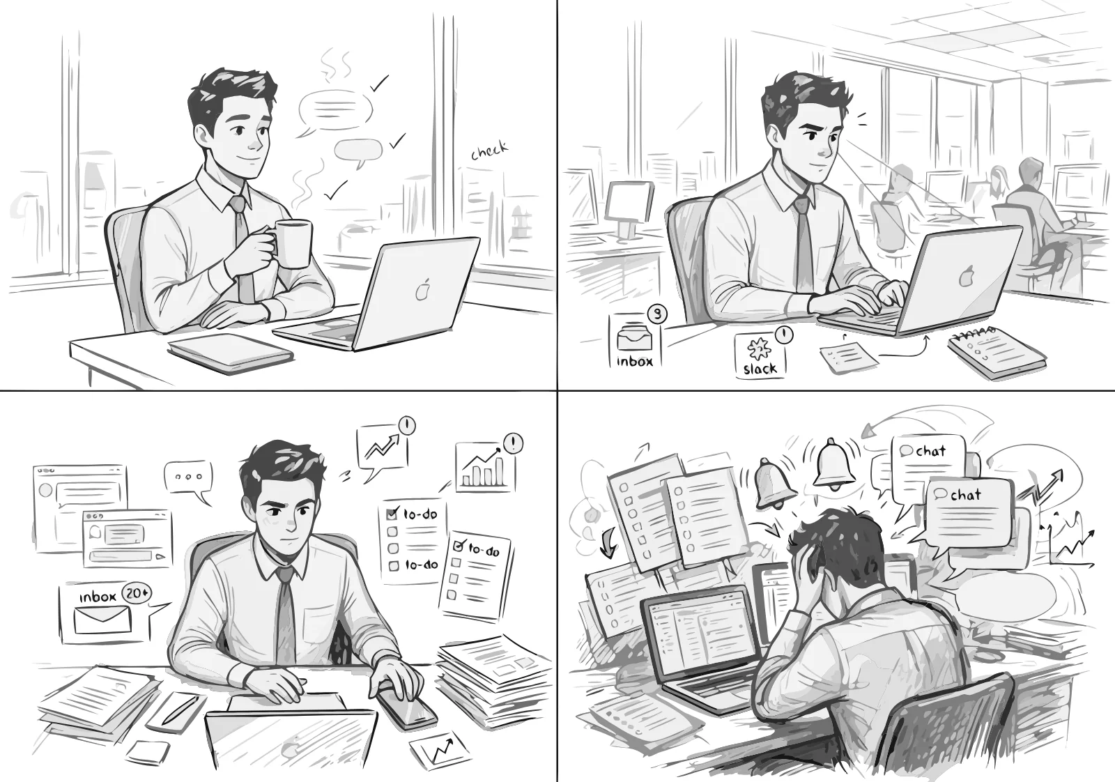
Email, chat, a spreadsheet, and a ticket queue, all pinging at once. Four switches in twenty minutes, nothing finished. That pattern is Q's cue: it appears as one small prompt and waits for Sam to say yes.
Concept animation, built in code with the app's real screens. A browser can't see other apps, so the live prototype simulates this moment with a timer. The desktop version is the next build step.
Five states, each one from research
Step through Sam's day. Each screen is from the working app, next to the interview quote that created it, and the design decision behind it.
Testing and iteration
Every change started with something a participant said or stumbled over. Each fix had to pass one test: more freedom, without putting the whole list back in front of them.
Round 1
"Why are these two numbers different?"
Round 2 · Caught a Round 1 fix
The fix that was too good.
Testing the fix caught what testing the design didn't.
Round 2
A number in Focus.


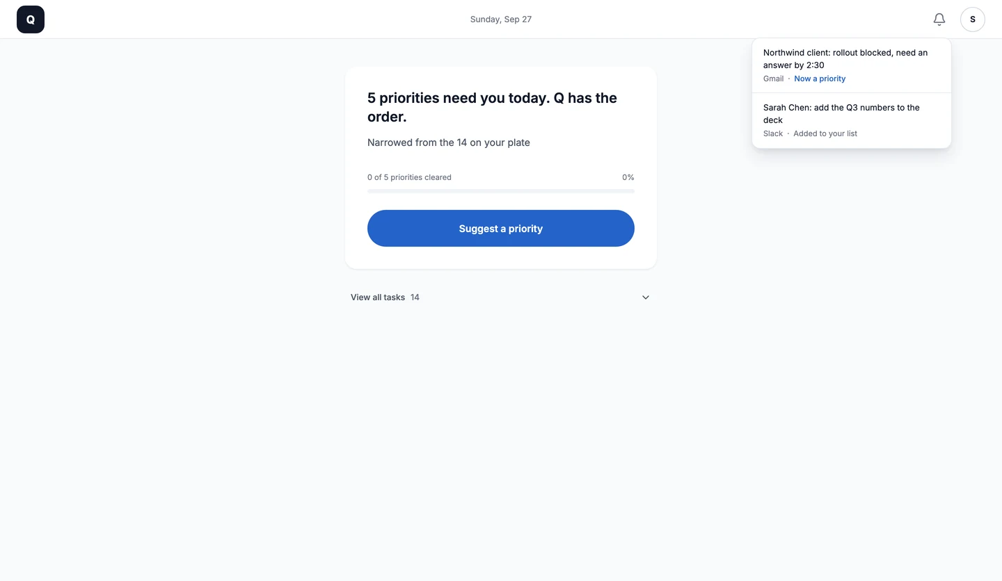
Also shipped: "Suggest another" kept to one alternative, not a menu · "View all tasks" demoted to a quiet link · "All clear" doesn't hide the bell list showing what came in · A home headline that tracks progress · A one-time tip to turn on Do Not Disturb.
What's next
First to tell "busy" from "overwhelmed", then to fine-tune Q's pick within the three rules, explained in the same plain words. Trust first, then automation.
"Anything from Sally, my boss, outranks everything else." Personal priorities, applied in the open.
A desktop app: the prompt appears over any app, switching is detected for real, and Focus turns on Do Not Disturb so Quiet covers everything.
Interview findings, the tool review, persona and journey maps, jobs to be done, ideation, the user flow, every key decision, the AI position, and both testing rounds, in detail.
Product design case study · Web app
A decision-support web app for the moment a workday stops being manageable.
It reduces cognitive overload.
The full list is the problem.
Task tools answer overload with more visibility. At peak pressure, people stall on choosing, not on doing.
One task, with the reason.
Q notices the overload, hides the list, and protects focus while you work. You always decide.
End to end, solo.
Research, synthesis, interaction design, design system, and the coded, deployed prototype, built with AI tools and no developer.
A live app, tested twice.
Five states, each traced to research. Eight changes shipped across two rounds of usability testing, in seven weeks.
At a glance
6 built in the live app2 designed, not built4 next
| Part of Q | Built | Designed | Next |
|---|---|---|---|
| Pull in work from email, chat and calendarThe live app runs on a realistic sample day; each task keeps its source. | |||
| Keep today's priorities apart from the full list12 tasks on the plate; 4 that matter today. | |||
| Offer help when switching spikesTimed in the live app; real switching in the section 10 demo. | |||
| Two signals before offeringThe flytrap rule. | |||
| Hold the offer until a pauseA sent message, a closed tab, a few seconds without typing. | |||
| Pick one task with three readable rulesUnblocked, time-sensitive, high-leverage. The reason is on every card. | |||
| AI ranking on top of the rulesRules first, so every pick can be checked. | |||
| Rules you set yourself"Anything from Sally, my boss, outranks everything else." | |||
| Focus: Quiet, progress, what came in | |||
| Reorient when something outranks the current task | |||
| All clear, then step back | |||
| A desktop app: detection across every app, Do Not Disturb turned on for youThe live app asks once for Do Not Disturb. |
Concept to deployed prototype
Production tools
sam / focus
How it started
Too much landed at once, and I lost the morning just deciding what to touch first. Not doing any of it. Just deciding.
I've spent almost a decade in enterprise software, watching task tools promise to make the chaos manageable. On a normal day they do. That day, the long list views added to the overwhelm instead of relieving it. I was stuck in a loop: pressure made choosing harder, and not choosing made the pressure worse.
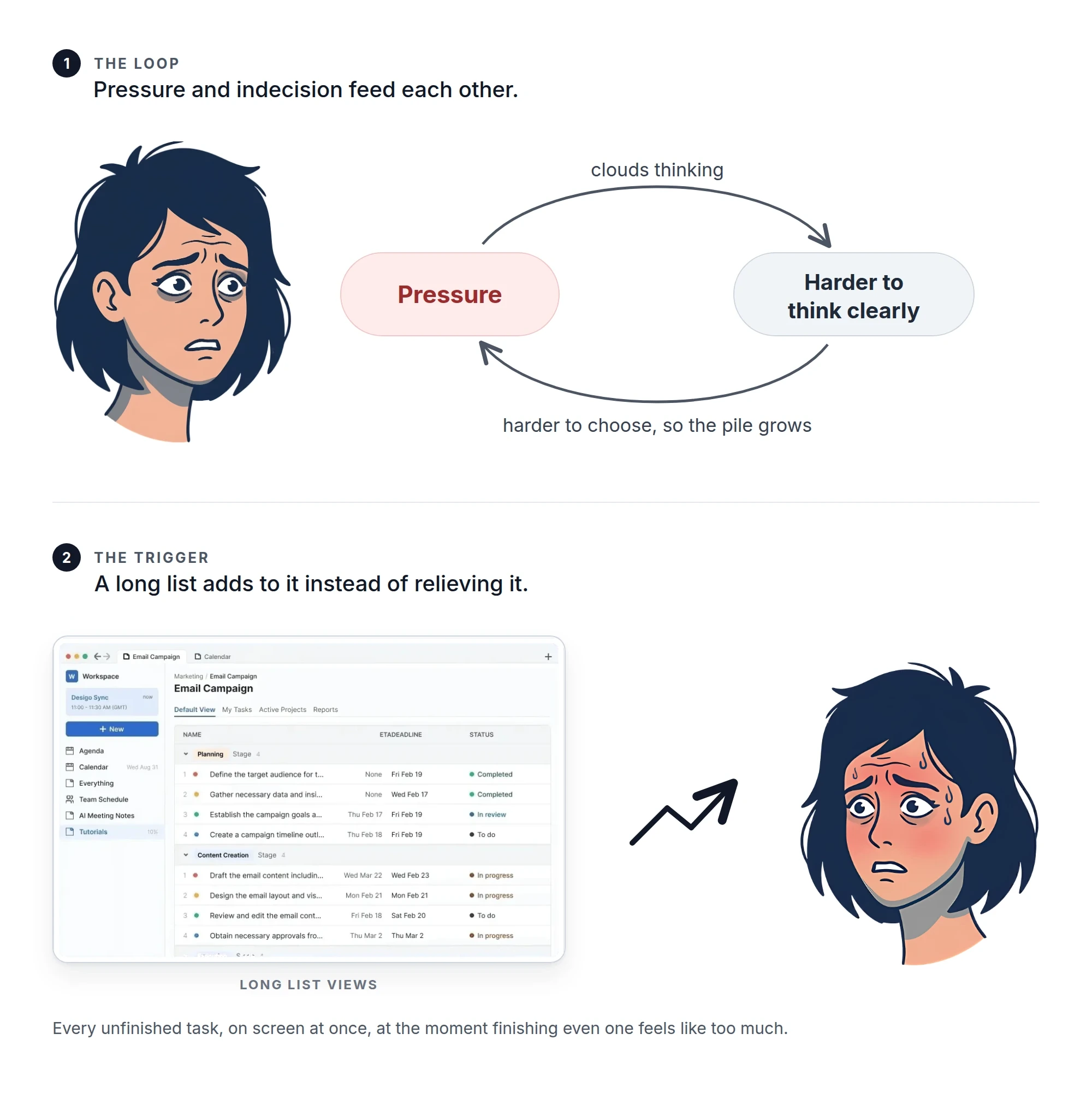
I assumed it was a me problem. So I asked around.
It wasn't just me. The same week showed up in four conversations: capable people, full plates, stalling not on the work but on the choosing. That was the pattern worth designing for, and it gave me one opening question:
Why do tools that are supposed to keep us organised stop working when we need them most?
01 · Discover
Starting hypothesis: When the volume of work becomes unmanageable, professionals lose the ability to prioritise.
I chose two sources for their opposite strengths.
The relief of writing everything down turns into anxiety as the backlog grows, then into paralysis at peak load. People stop using the tool's views, narrow to a single item, and eventually abandon the tool.
"The more I used them, the more overwhelmed I became. I opened Things 3 and saw 247 tasks staring back at me."Klaus Kneupner, DEV Community

If things get too hectic, I either step back and reset, or just go all in on one thing.Emile · starts each day with a clear top five

Every time a new task comes in, I tend to switch tasks.Sam · implementation specialist

If I finish the thing I need to do, then I feel relieved, and if I don't, then I feel more stress.Diana · a self-described list person

No tools — just mental assessments.Angela · the line that reframed the study
One group had a system that failed them. The other had no system at all. Both reached the same collapse, in the same order, and both invented the same fix: narrow to one thing and shut the rest out. Stop looking at the list. Silence the notifications.
The bottleneck isn't workload or features. It's decision paralysis under pressure.
That was the finding I hadn't planned for. If the breakdown happens with a tool and without one, the tool isn't the cause, and neither is the workload. What tips people over differs (volume for some, interruptions for others), but they all reach the same moment when choosing stops working.
My hypothesis was half right: people don't lose the ability to prioritise. They lose the capacity to turn priorities into a next move.
Days start with clear intent. Under pressure, structure breaks and behaviour turns reactive.
Overwhelmed people don't reach for a tool. They step back entirely, or narrow to one task and push through.
Deadline, impact, stakeholder pressure, and dependencies all matter, and so does available information. What I work on first is determined by the amount of information I have available.
New work arriving, not a deliberate re-evaluation, is the main trigger for switching.
High-effort tasks aren't forgotten. They're consciously pushed to quieter windows. I delay tasks I know will take the most time until after hours.
People trust their priorities; stress changes how they work through them. I feel overwhelmed by the amount of work, but not by choosing.
Priorities live in people's heads or in quick checks with peers, invisible to any system.
"I don't have a problem deciding. I just don't know what to start with when things get hectic."Sam, implementation specialist
01 · Discover, continued
"When I hit peak overload, having a view of all my tasks overwhelms me more."Interview participant
I reviewed four leading tools for how people behave in them, not for their feature lists, and asked one question: does this help someone decide what to work on when they're already overwhelmed? The answer was always no, for different reasons.
Flexible · user-built structure
Works
Breaks
A capture tool, not a decision tool. When you most need guidance, it offers a cursor.
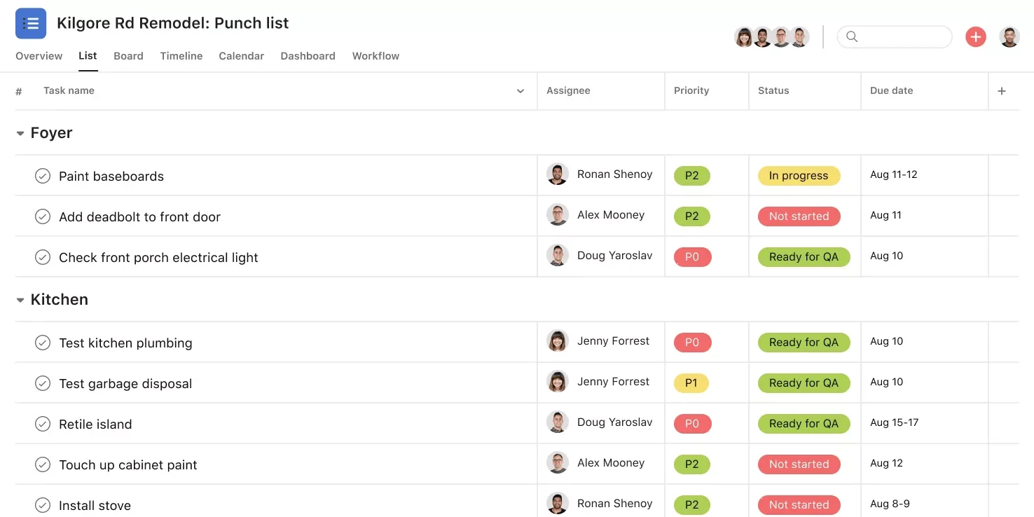
Collaboration-first · strong visibility
Works
Breaks
Great for the manager tracking a team; hard on the individual deciding what to start.
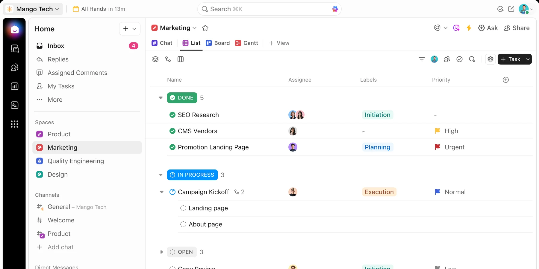
Feature-rich · highly configurable
Works
Breaks
The ingredients for decision support, with the assembly left to the user.
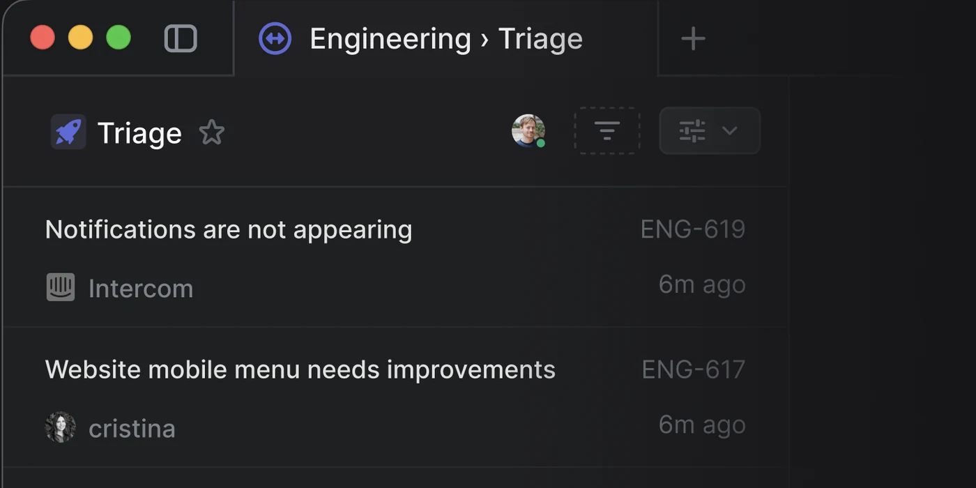
Built for teams · triage built in
Works
Breaks
Gates the team's intake, but nothing gates one person's list at the moment it overflows.
Team triage tools like Linear's already gate incoming work before it reaches the shared list, and every mature prioritisation method (ICE, RICE, MoSCoW) is a small, transparent rubric rather than a black box; Q brings both ideas to one person, at the moment their own list has become the problem.
People at peak overload don't need more visibility. The gap is a tool that makes the next call with you when thinking is hardest.
02 · Define
I rewrote each finding as a design implication, so every one could be held against a later decision.
People don't lack plans; they lack plans that survive a hard day.
→ Design for the worst hour, not the ideal one
Going to one task is adaptive, not a failure.
→ Support one-task mode; don't force the list back
Under pressure, "what can I act on now" wins over "what matters most".
→ Rank unblocked work first
Tasks without enough context get pushed down whatever their value.
→ Readiness is a first-class ranking input
Heavy tasks are deliberately deferred.
→ Lower the cost of starting: show the first steps
People know what they should do.
→ Support doing, not second-guessing
Mental tracking is slow and invisible.
→ Take the deciding off their plate, visibly
Problem statement
Professionals juggling many responsibilities struggle to make task decisions under cognitive and situational pressure, because their tools are built for organising, not deciding. They help people store work. They don't help people choose what to work on.
HOW MIGHT WE
Help professionals decide what to do next when cognitive load peaks?
Identify and commit to their most actionable next task during moments of peak cognitive load, so they spend less time deciding and more time doing?
Why "professionals", not "users". The word narrows the design: people with real stakes, other people waiting on them, and tools already in place. The short question is the anchor; the long one is the working definition I tested every idea against.
03 · Empathise
"I know what needs to get done. I just postpone heavier tasks, mostly until after hours, when things feel less hectic and I can finish without distractions."
Several participants said their prioritising was fine, but their behaviour said otherwise: they put off important tasks to avoid being interrupted, waiting until after hours for quiet. Overwhelmed people avoid lists and struggle to hold focus. Their tools answer with longer lists and more notifications.
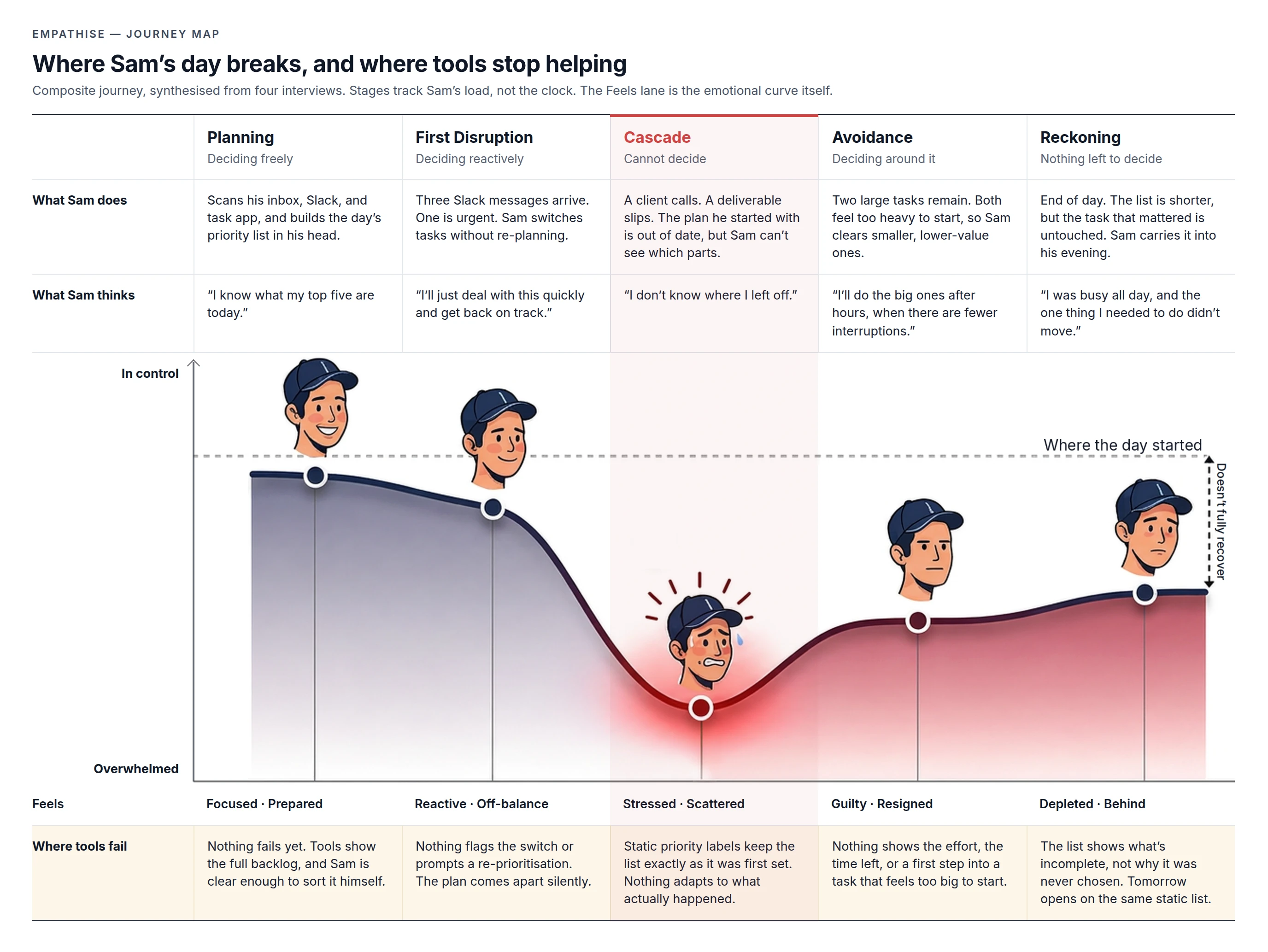
Pattern. Tools don't fail while Sam is clear. They fail once the plan is disrupted and he most needs help getting his bearings. This is where the product should step in: at the start of the cascade, before the low point.
04 · Jobs to be done
"Jobs to be done" asks what people are really hiring a product to do. Here, they're hiring it to think with them. I started with four jobs and merged the two that overlapped (handing over the choice, and being nudged when blocked), leaving three that map to the later product states.
→ Detecting, Recalculating
→ Suggesting
→ Focus active, Recalculating
05 · Ideate
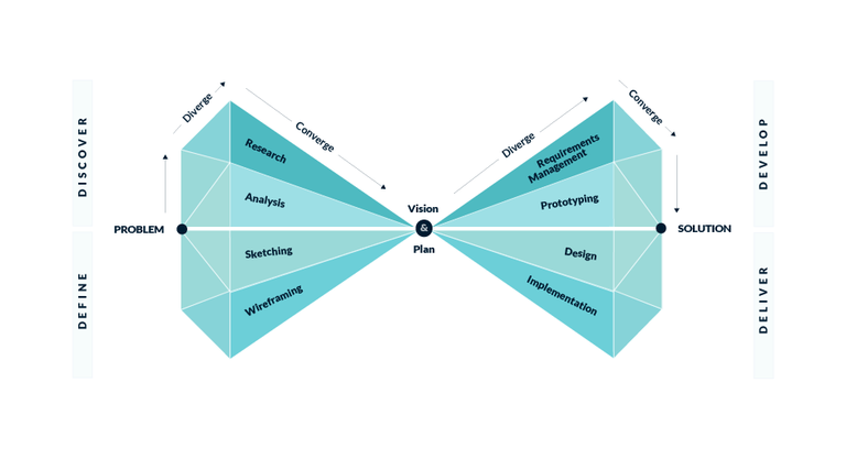
Up to here I researched the problem, defined it, and built a persona and journey map. That first half of the Double Diamond is about finding the right problem. The second half is about finding the right solution: start wide, then narrow.
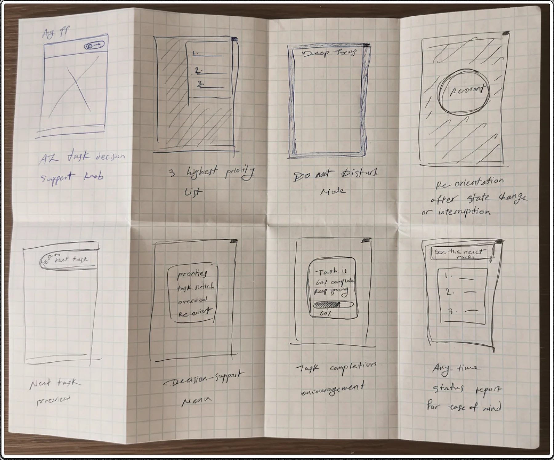
A rapid sketching exercise, run on paper against the short "how might we" question, for speed over polish. Four of the eight ideas turned out to be parts of one system.
SCAMPER is a checklist of prompts (Substitute, Combine, Adapt, Modify, Eliminate, Rearrange) for pushing an idea further. Each prompt changed the design.
What if the manual AI knob became automatic detection?
Behaviour signals (rapid switching, idle time, interruption count) trigger an offer of help. The product reaches for the person, not the other way round.
What if re-orienting and the task list were one thing?
It re-ranks when something new arrives, and the list is always reachable. Two features, one place, no jumping between screens.
What pattern elsewhere already solves this?
GPS recalculation. Miss a turn and the map doesn't list every route; it recalculates silently and gives one instruction.
What if three tasks became one?
Three still asks for a choice. One removes it, which is what a person at peak load needs. "Suggest another" handles disagreement, one alternative at a time.
What if re-orienting never had to be manual?
It re-ranks on its own whenever the situation changes. Manual control stays available but is never required.
What if activation reassessed everything, including the current task?
Activation means "reassess and tell me what to do now". It may recommend stopping current work if priorities have shifted.
06 · The solution
Q models the natural defence against overwhelm: it cuts the noise and locks onto one task. Unlike a stressed mind, it stays sharp.
At peak load, Q steps in:
Q does not take over. It suggests and nudges, and the full list stays one click away, because an overwhelmed person won't hand their day to a system they don't trust yet.
Each state below comes from something a participant said. That's what makes them evidence, not preference.
"When I get stressed, I tend to switch tasks multiple times without meaningful progress in each one."
Exists because help has to arrive before overwhelm, not after.
"I know what needs to get done, but I tend to avoid them and switch to easier tasks to give myself that dopamine hit."
Exists to make the call once choosing stalls: One task, with the reason.

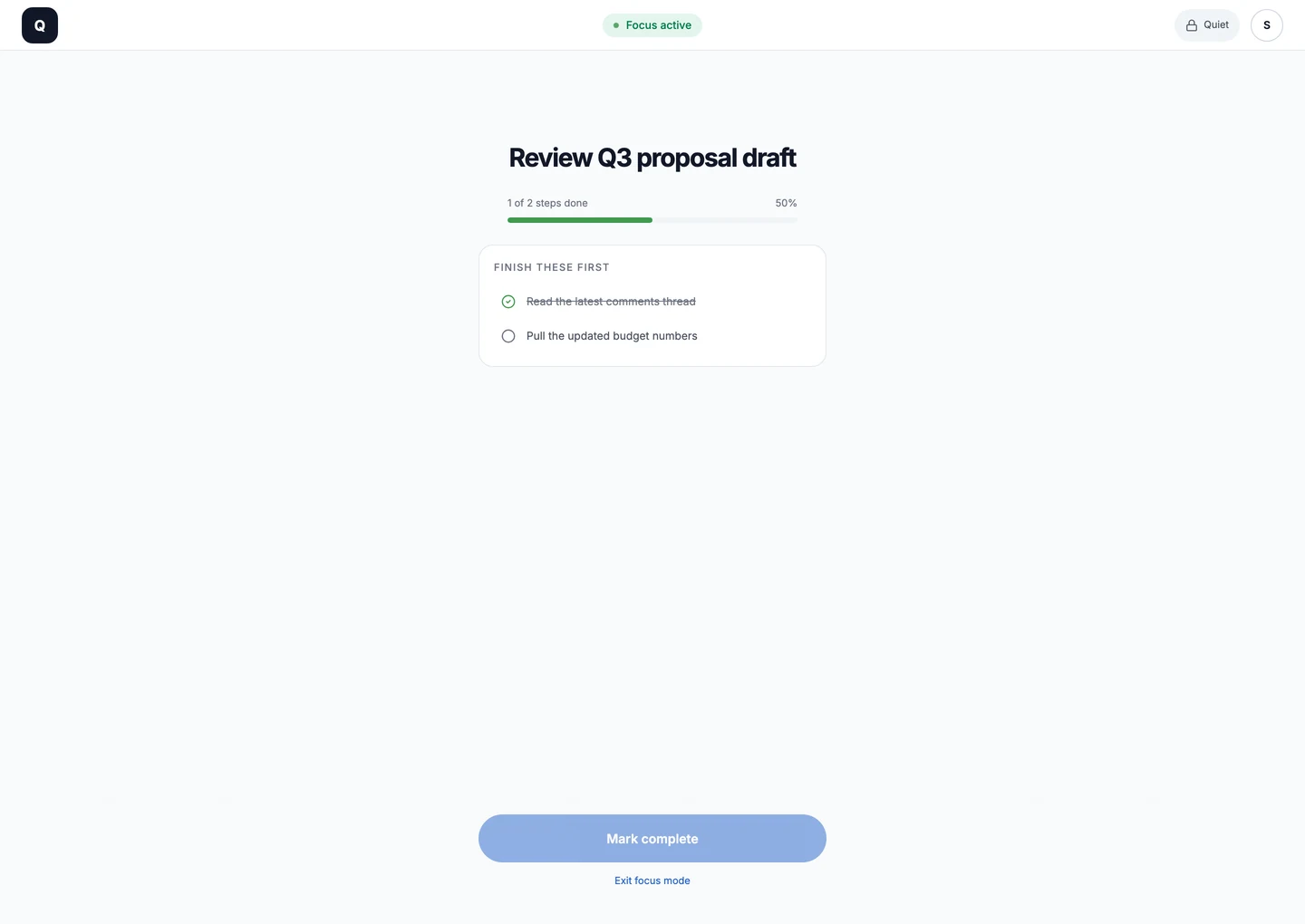
"When I know I need to work on a task, I pick one item and lock in. I close Slack, I close everything, and just do that one thing."
Exists to protect that state for you, instead of relying on willpower.

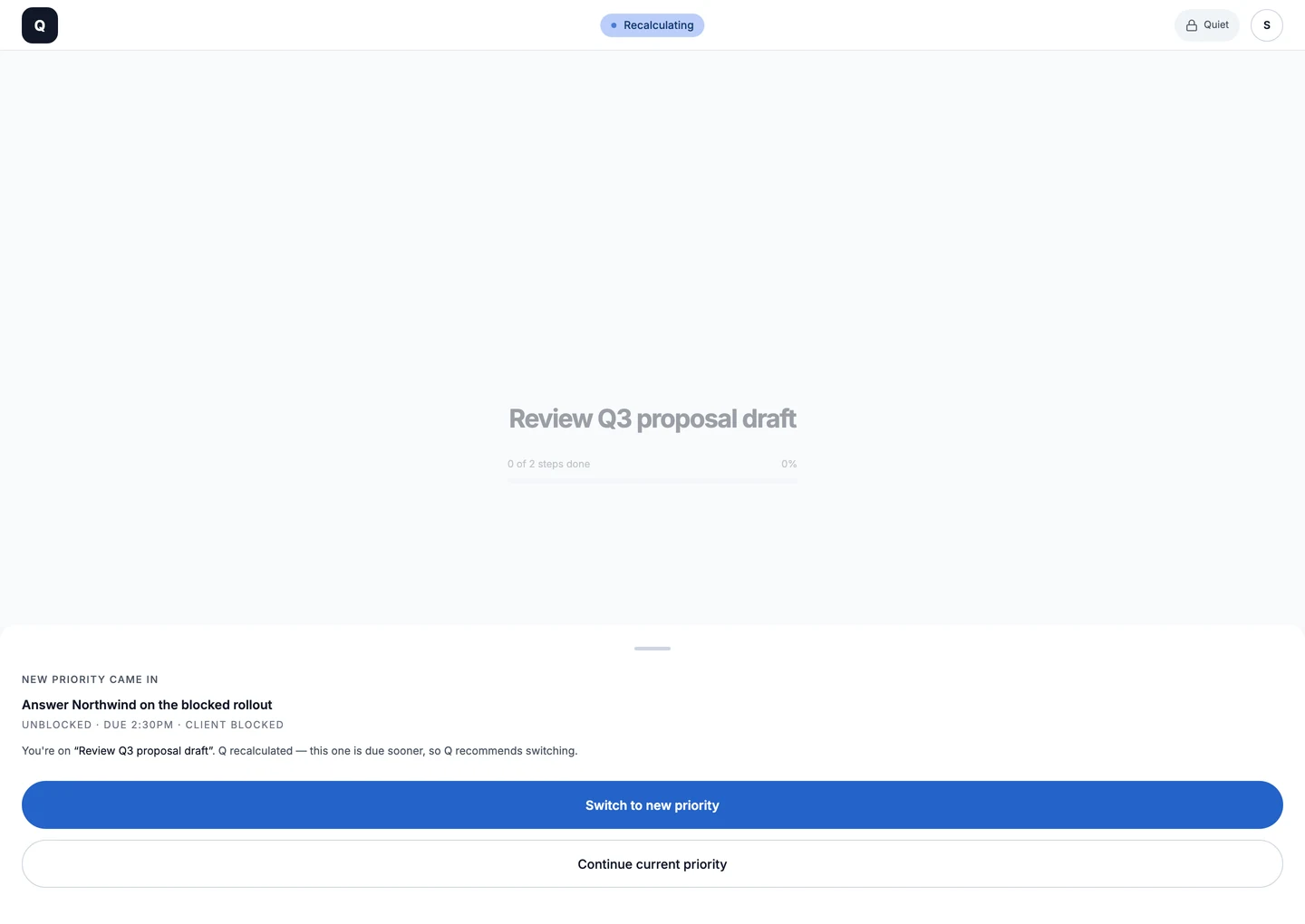
"Every time a new task comes in while I'm in the middle of completing another one, I quickly try to mentally reassess whether that new incoming task needs my attention more to decide whether to continue with the current task or switch."
Exists to re-rank when a task is done or something more urgent lands.

"I'm usually pretty good at setting my priorities mentally if my day's not that chaotic."
Exists because clarity returns once the urgent work is done. Q shows All clear and hands the rest of the day back.
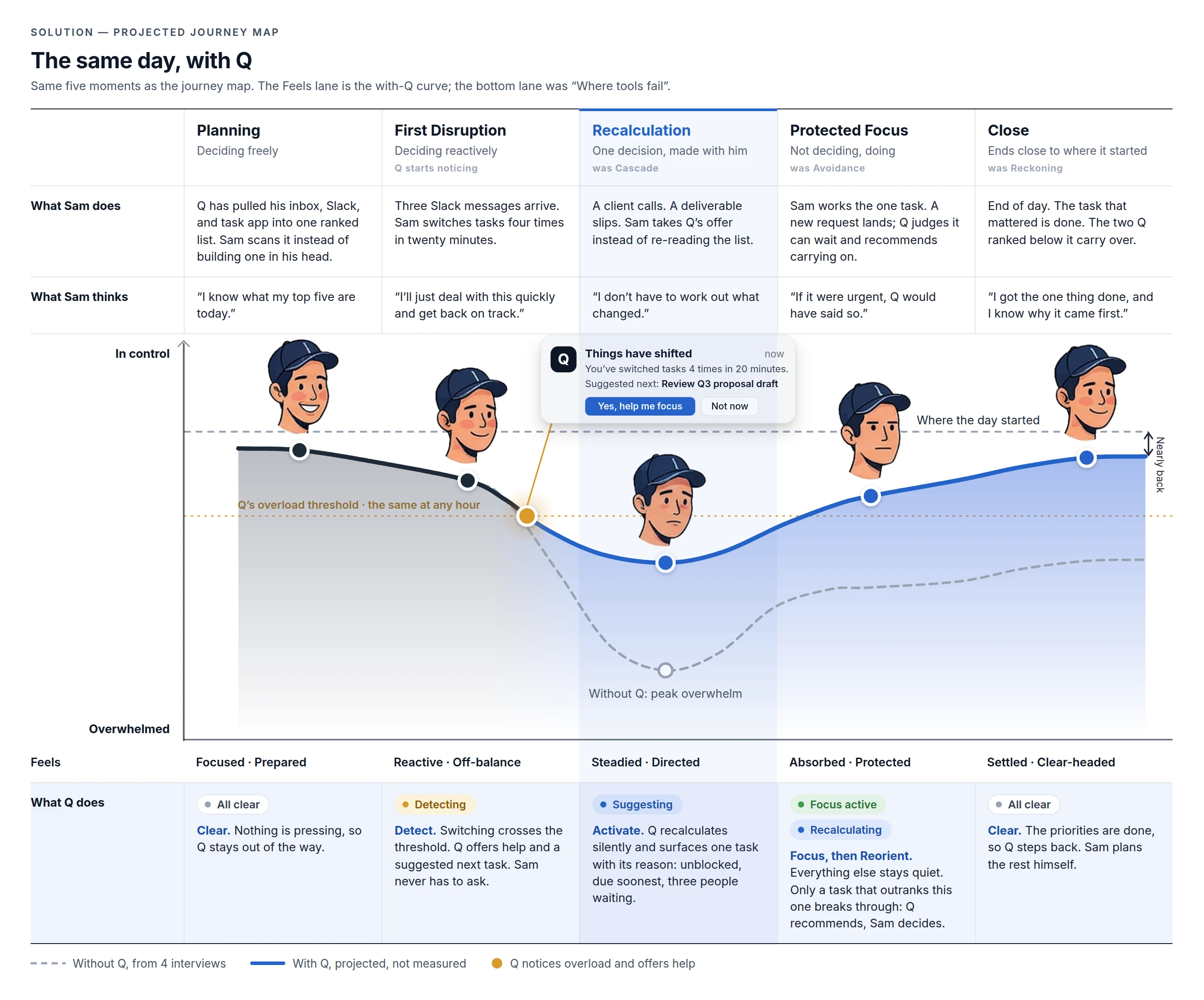
Q steps in on the way down. By the time the old curve bottoms out, the decision is already made.
07 · System
With the story in place, here is the system itself. Every decision point has two labelled exits, and every screen can return home, so Sam is never trapped.
Each coloured zone is one of Q's five states, labelled with the status pill it shows. Ambient is home.
08 · Key decisions
Decision 5
Decision 6
An earlier version showed "3 held · quiet" in the Focus nav. Testing showed the problem: a number invites checking, and every change pulls Sam out of the task to see if it matters. It also promised control a web app doesn't have: a browser can't hold anyone else's notifications.
Now Focus shows a lock and one word, Quiet. No count, no bell. Q sorts everything that arrives in the background. Anything that can wait goes onto Sam's list without a sound and shows up in the bell after Focus ends; the dot means unread, nothing else. Only a task that outranks the current one interrupts: Reorient opens by itself, Q's recommendation is the main button, and Sam's choice is final.
The first time Sam enters Focus, a one-time tip asks him to turn on his computer's Do Not Disturb. Q can't do that from a browser, so it asks once, plainly, instead of pretending.
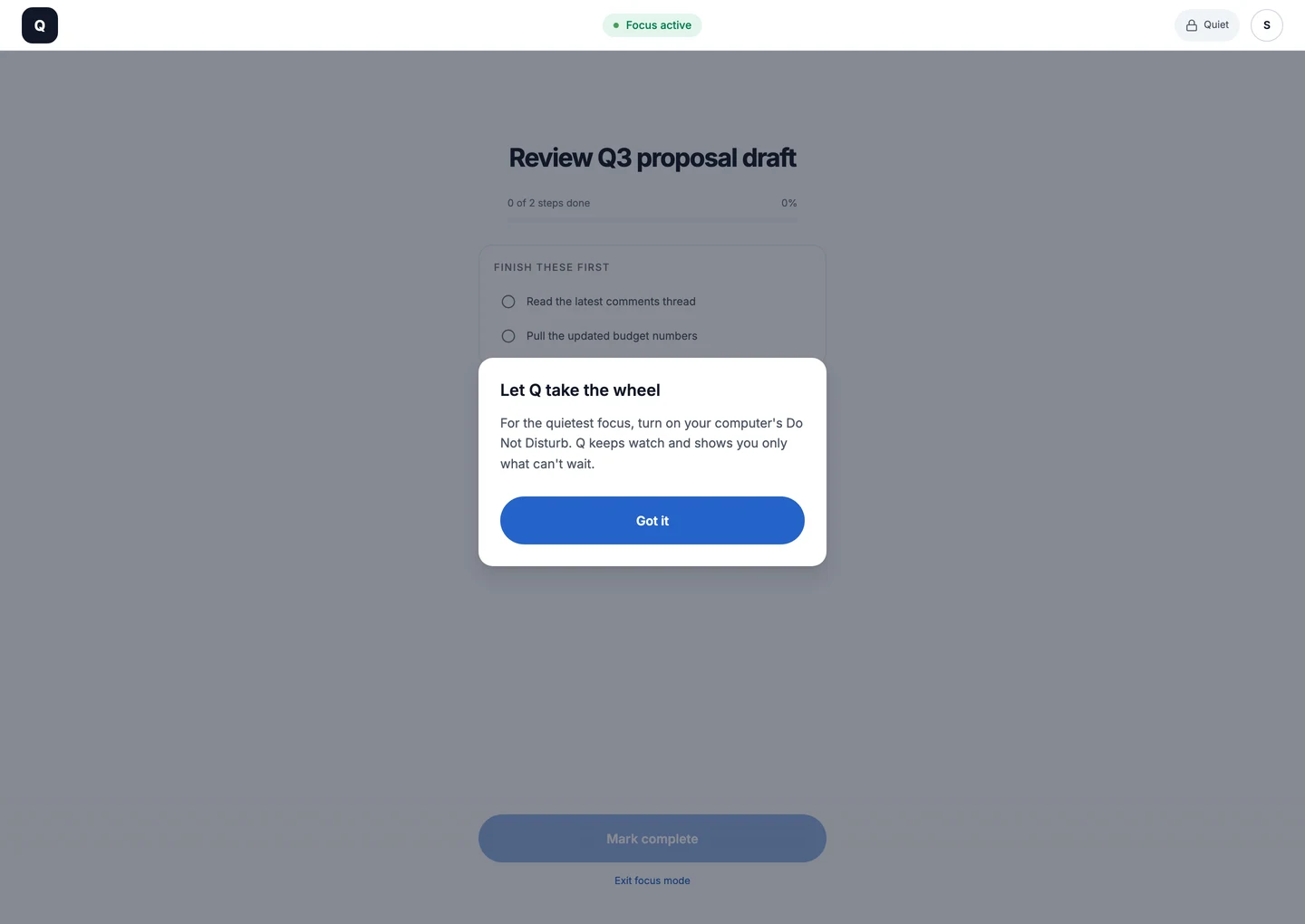
Why it holds up. "Quiet" describes what Q itself does, so it's true in the browser today. The desktop version turns on the system's Do Not Disturb, so Quiet covers every app, not just Q.
09 · How it works
It reads the places work already arrives (email, chat, calendar, and task tools) and builds the list for you. In the prototype, this list is a realistic sample day.



 → one ranked queue
There is no "add task" button. Q pulls from where work already lives. Asking an overloaded person to maintain another list would add the very load Q exists to remove.
Whatever Sam has open, Q appears as a small prompt once the switching pattern crosses a threshold. It expands only when he engages, and "Yes, help me focus" takes him into the app.
Prototype scope. A browser can't see other apps or draw on top of them, so the live prototype simulates detection with a timer and shows the prompt inside the app. I kept it in the browser on purpose: reviewers can try it from a link in seconds, and detection is the riskiest assumption, so it's tested as a concept before it's built for real on the desktop. Section 10 rebuilds detection in code, so it reacts to real switching on the page.
Three rules, applied in order. Rules you can read, not a score you have to trust blindly. Each one comes from a research finding.
You can start it right now. Under pressure, "can I act on it" beats "does it matter most".
Soonest deadline first.
The most tasks and people are waiting on it.
Q ranks by urgency and who's waiting, not by calendar fit. It doesn't know how long a task takes, and it doesn't pretend to. If a pick doesn't fit the moment, the user asks for another. Scheduling around meetings is a planning job, and Q is built for the moment of decision.
Q only works on today's priorities. Sam's plate has 12 tasks; Q narrows them to the 4 that matter today. A new task that outranks them joins the set (4 becomes 5); anything that can wait just joins the list. When the priorities are done, Q shows All clear and steps back. Everything else stays on the list but never enters the loop.
10 · Detect → Activate, in code
The live app simulates Detect with a timer, because a browser can't see other apps. That left the riskiest assumption untested: when Q offers help, does it feel like help, or like being watched?
So I rebuilt the moment everything hinges on, from the first signal to one task, on real behaviour. Below, Q counts your clicks the way it would count Sam's switches, then runs the same three rules to pick his task.
3 more priorities after this. The rest can wait.
Switch tabs the way you would on a bad morning.
Each second here is one minute of Sam's day. Or press play and watch his morning unfold.
"When I get stressed, I tend to switch tasks multiple times without meaningful progress in each one."
The rule, exactly as it runs in the prototype aboveconst WINDOW = 20;    // minutes Q looks back
const SHORT = 5;      // leave sooner: no real progress
const THRESHOLD = 4;  // short switches before Q asks
const QUIET = 30;     // minutes of quiet after a "no"

function shouldOfferHelp(switches, now, quietUntil) {
  if (now < quietUntil) return false;
  const stalls = switches.filter(s =>
    now - s.at <= WINDOW && s.stayed < SHORT);
  return stalls.length >= THRESHOLD;
}
Four quick exits in 20 minutes, and Q offers help.
A switch counts only when Sam leaves a task within 5 minutes. That's the quote, turned into a rule. Long stretches are work, so they never count.
Why it matters. An offer to help can't cost privacy. Counting is all the rule needs, so counting is all Q does.
Busy and overwhelmed both switch a lot. Overwhelmed switches without getting anywhere. One rule about how long a stay lasts tells them apart, and it's the baseline any model in the next section would have to beat.
"You've switched tasks 4 times in 11 minutes" is something Sam can check. "You seem stressed" is a judgement, and a wrong one costs trust.
If declining doesn't stick, the help becomes the interruption. The count also starts over, so old switches can't trigger a second offer.
The window, the stay length, the count and the quiet time are the least certain numbers in the design. Each lives in one place, so it can change between test sessions without touching the interface.
A Venus flytrap can't afford to close on a raindrop. It shuts only when a trigger hair is touched twice within about 30 seconds, and it starts digesting only after about five touches.
Q faces the same trade. An offer on a busy-but-fine morning costs trust, so the next version of the detection rule borrows the plant's logic.
One signal fadesTwo inside the window act
One touch could be a raindrop. Two within 30 seconds is prey.
Busy people switch a lot too. Overwhelmed people switch without getting anywhere, so a second kind of signal (a stall or a new interruption) has to confirm the first.
A single touch is forgotten. In Q, older switches would count for less instead of dropping off a hard 20-minute edge.
Closing is cheap; digesting takes about five touches. Q's offer is the cheap step. Focus and Quiet only follow a "yes".
A trap shut on a twig is out of action for hours. A wrong offer costs trust, so the thresholds lean towards missing a moment rather than inventing one.
Designed, not built yet. The demo above still runs the four-switch rule; the next testing round compares the two. Source: University of Würzburg on how the flytrap counts (Böhm et al., Current Biology, 2016).
A correct signal can still arrive at the wrong moment. If Sam is halfway through a reply to a client, an offer to help is one more interruption.
So Q holds the offer until the next natural pause: the message is sent, a tab closes, or typing stops for a few seconds. Only then does it appear.
Why wait. In a study of notification timing, holding notifications until a natural break in the task, instead of delivering them at once, reduced people's frustration and how long they took to respond (Iqbal & Bailey, "Effects of Intelligent Notification Management on Users and Their Tasks", CHI 2008). Designed, not built yet: the demo above shows the offer as soon as the count is reached.
Participants work through the prototype, then describe the offer in their own words.
Too early, and Q nags. Too late, and it misses the dip on the journey map. The session notes where each participant expected the offer.
Whether 30 quiet minutes reads as respect, or as Q giving up.
The four-switch rule and the flytrap rule run side by side. The session counts offers participants didn't want, and moments they wanted help and got none.
Even at a pause, the moment can be wrong. The test adds "Yes, but not now", which brings the offer back at the next pause. "I'm fine, thanks" still means 30 quiet minutes.
Still a browser. The prototype only sees switches inside this page. On the desktop, the same function would read window changes from the operating system. The rule stays the same; only the source of the signal changes.
11 · The AI question
Ranking tasks and reading someone's context are natural jobs for AI, so leaving it out of version one was a deliberate decision, not an oversight. Trust is the constraint: a person at peak pressure won't hand the choice to something they can't understand, and one unexplained pick costs more trust than ten good ones earn.
Three rules, shown on every card as plain tags. Sam can predict and check every pick.
Telling "busy" apart from "overwhelmed" before Q offers help is the best first job for a model, and the riskiest assumption in the design.
A learned layer that fine-tunes the order within the rules and explains itself in the same plain words.
12 · Testing & iteration
I put the clickable prototype in front of participants, fixed what they tripped over, then had Sam test the rebuilt app end to end. Every fix passed one filter: give people more freedom without putting the full list back in front of them.
A self-review before the first round caught four defects (duplicate icons, a progress bar that ignored sub-steps, two progress formats, a switch that could land on the same task). They're fixed and not interesting.
F1
"Why are these two numbers different?"
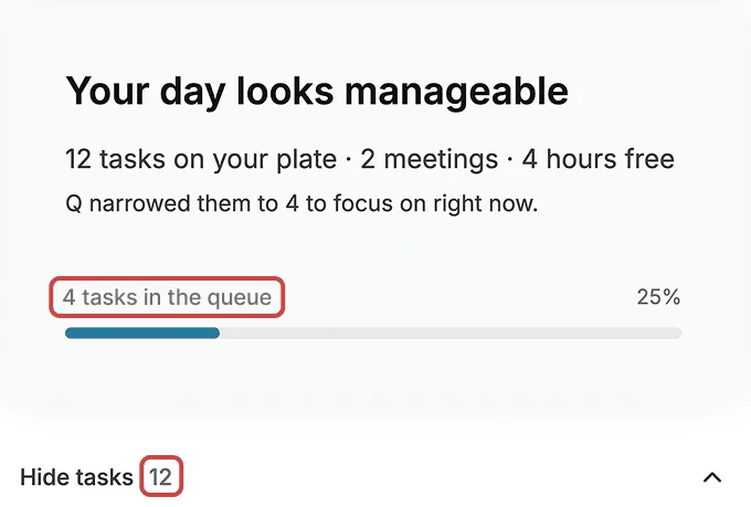
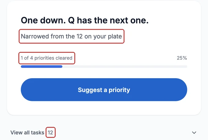
Why it mattered. The confusion was the product. Narrowing 12 to 4 is what Q does; the fix was to say so. This became the line the whole case study leads with.
F2
"What if I want a different task than Q recommends?"
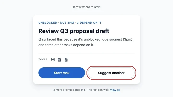
Why it mattered. The first suggestion was to offer two or three alternatives. I kept it to one. The finding was "I want a say", not "I want a menu", and every extra option slows the choice down for someone who is already stalled.
F3
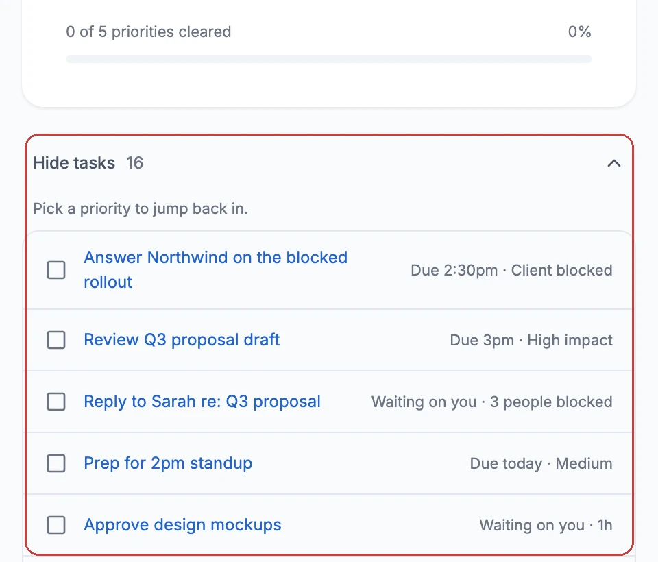
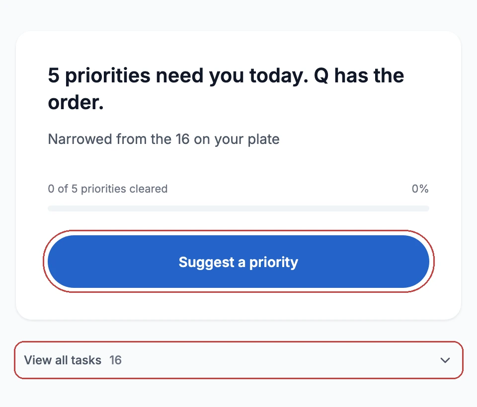
A dead end, and then a fix that was too good.
What Round 2 showed. The clickable list quietly became the way back in, and the list was open every time he came home. So Round 2 added "Suggest a priority" on home, made "You started this one. Q still recommends finishing it." the answer for a paused task, and collapsed the list on every return. Opening it is always his choice.
Why it mattered. The fix solved the dead end and undermined the thesis. Testing the fix, not just the design, is what caught it.
F4
A number in Focus kept pulling him out of the task.
Why it mattered. Two things were wrong. A number invites checking, so every arrival looked like it might matter. And "held" promised something a browser can't do: it can't hold anyone else's notifications. "Quiet" describes what Q itself does, so it's true today; the desktop version turns on Do Not Disturb so it covers everything.
F5
"All clear" hid what had come in.
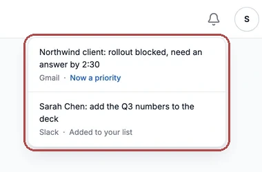
Why it mattered. "All clear" is a claim about the priorities, not about the day. Hiding what arrived would make Q dishonest at the exact moment it hands control back.
F6
"Manageable" mid-day.
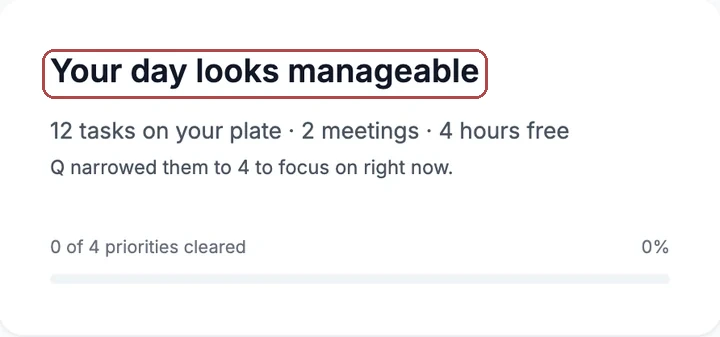
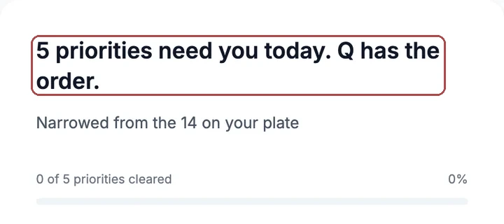
Before Detect has ever fired, it still says manageable: that's the moment it stops being true.
Why it mattered. Calm copy that's false isn't calm. Factual, never praise, and Q always carries the order.
One fix I cut: a summary line after Focus ("While you focused: 3 new, 2 from Sarah"). The dot already said it. A prototype with no found problems is a prototype no one tested.
13 · How I built it
There was no developer on this project. The live app, the concept animation, the diagrams, and this page were all built by me, with AI tools doing the typing and me doing the deciding. That's not a footnote to the design work: it's why two rounds of usability testing were possible at all. A working app was cheap enough to change that every finding could be fixed and re-tested within days.
Two processes ran side by side: a technical one for the product and the case study, and a visual one for the illustrations, diagrams and motion.
I wrote the product into plain-language spec files first, then handed those to the coding tools. Context engineering, not prompting.
CLAUDE.md: what Q promises, every rule, every exit, what never to touchSCREENS.md: each screen, its state, what's on it and how it relates to the othersDESIGN-TOKENS.md: the colour system as the single source of truth
Claude Code read the briefs and wrote the React app in one pass: audit, plan, confirm, implement. I made the small changes myself in Cursor's editor, especially copy and the case-study HTML, and used the terminal for the repetitive parts.
npm run dev to see every change livegit add · commit · push on a branch per change
Rules I couldn't hold in my head went into the pipeline, so the tools couldn't drift from the design.
check:tokens runs before every build and blocks a deploy if a raw colour appears in codeThese tools bill by the token, so process discipline was cost discipline. A few habits kept a seven-week, one-person project affordable.
CLAUDE.md opens with hard limits: don't rebuild, don't redesign, don't read Figma, don't add dependencies, plan first and wait. Every rule there is one round-trip I never paid for again.Nothing here was right the first time, and the process assumed that. Each artefact started as a fast first draft, then went through named versions until one held up in front of a participant or a reviewer. The storyboard took four versions before the panels read in order; the emotional curve took six before it plotted one thing instead of two. The app itself went through two full builds: the July build that Round 1 tested, and the September rebuild that Round 2 tested. The Testing section above is what this loop looks like from the outside.
The repositories are private. I'm happy to walk through any of them in an interview.
The prime directive. Do not rebuild, redesign, or re-extract anything. Reuse what exists. Make minimal, surgical changes. Before writing any code, list every existing page in the repo and your plan, then wait for confirmation.
Hard constraints (these protect a limited budget).
tokens/; use them.Illustration, diagrams and motion came from different tools, so the job was keeping them in one voice: the same navy-and-blue palette, the same calm register, nothing decorative. Adobe Firefly drew the people and scenes from written prompts. Paper generated several takes on a screen at once, so I could brainstorm layouts side by side before committing to one in Figma. Figma held the journey maps, wireframes and screens. Claude wrote the diagrams and the concept animation directly in code, so they share the page's own tokens and stay editable as text. This site's structure started from a template drafted with Grok, then built out in Next.js.
This case study first lived on my previous portfolio. There, Figma Make and Framer's agent made quick, site-wide changes in one pass instead of page by page.

What this means for a team: the research gets a working prototype, not a promise of one, and engineers get a reference build to read instead of a file to interpret.
14 · Design system
Q is built from one set of design tokens and three shared components. It's small on purpose: a product that hides everything but one task shouldn't need many parts.
blue/600#2563C9accent/primary Primary actionsbutton/primary/bg The primary buttonComponents never touch a raw value. Change one meaning, and every screen follows.
Blue is an accent, not a text style. Headings and body copy are grays. Blue is kept for links, the primary action and the status pill. The one purple belongs to the Do Not Disturb moon.
Line height follows size. 1.5 up to 16px, 1.35 at 18 and 20px, 1.2 from 24px. Weights run from Regular to Bold; Medium carries most labels.
Anything Sam clicks is fully round. Cards and dialogs take 16px; popovers and the logo tile, 12px.
Twelve steps on a 4px grid. Buttons are 12 by 24; cards pad 24 or 32.
Depth comes from shadow, not borders. Small for cards, large for the Detect card and dialogs. Each is two layers of a cool dark, never pure black.
A white bold Q on the darkest gray. Drawn in code in the app's own typeface, so it never needs an image file.
15 · Accessibility
Q's colours live in one design-token system with three layers: raw values, their meaning (such as "primary action"), and their use in each component. A check at build time blocks any release where a raw colour sneaks into the code. The primary blue is #2563C9, a shade darker than the obvious choice, so white text on it meets WCAG AA, the standard accessibility bar for contrast.
16 · Reflection & what's next
First to tell busy from overwhelmed, then to fine-tune the order on top of the three rules, explained in the same words.
"Anything from Sally, my boss, outranks everything else."
A desktop app: the prompt over any app, real switching detection, and Focus that turns on Do Not Disturb, so Quiet covers everything.