Product design case study
Gentle View
A stress-relief app that asks one question about how you're doing and answers with one thing to try, plus a plain reason why.
Where this stands. The build came first. It's the Deliver half of the double diamond; Discover and Define still need doing. Everything below about what people need is a hypothesis until it's tested.
Wellness apps ask for decisions at the moment people are worst at making them.
Which of 200 meditations, how long, which teacher.
One question, one suggestion, and the reason.
The library is still there for people who know what they want.
A working web app, on phones and laptops.
Six sections, five original meditations, history, and a token system mirrored in Figma. The iPhone app is coming soon.
01 · The problem
The library becomes one more source of load.
When people are stressed, drained or overwhelmed, wellness apps ask them to make exactly the decisions they're worst at in that moment. Choosing is a cost, and it's highest when capacity is lowest.
Asking one question about someone's current state, and answering with one suggestion and a plain reason, gets them into a regulating practice faster, and more often, than browsing a library.
How might we help people settle their nervous system when they're too overwhelmed to choose how?
02 · Principles
Six principles, and what each one costs.
Each principle comes with a trade-off I accepted on purpose.
03 · The solution
One question. One thing to try. One reason.
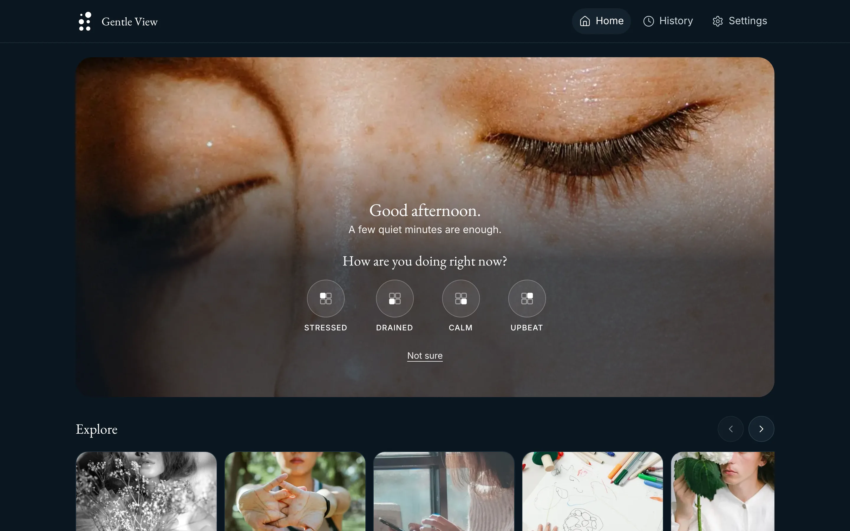
Home asks how you're doing right now. Pick one state or several, and the app answers with a single suggestion and says why it fits. Try the toggles: they're the real component.
How are you doing right now?
Meditate
Longer breath out
When you’re keyed up, a breath out that’s longer than the breath in is the quickest way to bring the pace down.
Everyday words on the outside, the Mood Meter underneath. The answer is one card, never a list.
Four states: the four corners of the Mood Meter
Stressed
High energy, unpleasant: tense, on edge, too much going on. Suggests "Longer breath out".
Drained
Low energy, unpleasant: tired, flat, running on empty. Suggests "Come back up".
Calm
Low energy, pleasant: okay, settled, at ease. Suggests "Stay with it".
Upbeat
High energy, pleasant: good, hopeful, excited. Suggests a few minutes of Move.
Why these four. The first set (Wired, Heavy, Scattered, Steady) described the body or the mind, not a feeling, and Heavy could mean sad or tired. Marc Brackett's Mood Meter, from the Yale Center for Emotional Intelligence, places a feeling on two axes: energy, and how pleasant it is. Each button is one corner of it, named in the word people actually say. The icon is the meter itself: the filled square shows where that state sits.
A closer word is one optional tap away. With one state picked, "Closer to one of these?" offers the precise words, for example Anxious, Overwhelmed, Fed up or Angry under Stressed. Each has its own pick. People who'd only ever say "stressed" never have to go further. Anger gets slow breathing, not a run: in a 2024 review of 154 studies, calming the body reduced anger, and most high-energy exercise didn't. "Not sure" skips the words entirely and goes to a body-first practice.
Mixed states get one pick too. All 15 combinations of the four states have their own suggestion and reason, chosen by hand and covered by a test. "Stressed and drained" isn't an average of two answers; it's a slower breath out that doesn't ask for energy you don't have.
04 · Key decisions
Each decision removes a choice, a wall or a surprise.
The loop closes
- Decision
- After a practice, the app asks "How do you feel now?"
- Reason
- "Worse" offers a different kind of practice and support options, never just "try again".
Guest mode first
- Decision
- Everything works without an account.
- Reason
- A stressed person shouldn’t meet a sign-up wall. Accounts only carry history across devices, and guest history merges in on sign-up.
Sections in one quiet row
- Decision
- One sideways row of photo cards under the check-in. It replaced a two-column grid.
- Reason
- The photo and the question come first; the sections wait below, with History beneath. The trade-off: a phone shows two and a bit cards, and the cut-off third says the row scrolls. Laptops get a carousel with previous and next buttons.
History gets its own tab
- Decision
- Three places: Home, History, Settings.
- Reason
- Finding something again is the differentiator. History logs every open and shows each item once per day. A phone gets a tab bar; a laptop gets the same three links in a top bar.
The suggestion stays compact
- Decision
- A small photo tile, not a photo banner.
- Reason
- With a large photo, the sections fell below the fold. The card keeps its parts: tag, duration, title, reason, one Begin button. Its photo is the section's second one, so it never repeats the card just below it.
No bold, no capitals
- Decision
- Two weights only, 400 and 500. Titles in sentence case.
- Reason
- Hierarchy comes from size, the serif and sans pairing, and space. It reads calmer and more confident.
05 · The AI question
Deliberately no chatbot in v1.
Open-ended conversation adds load when someone is dysregulated, and a model responding to someone in crisis carries clinical and safety risk that a prototype shouldn't take on.
Personalisation comes from simple counts of the person's own answers: "what's helped" and "helped you last time you felt stressed". It's transparent, private and easy to explain.
Where AI could earn its place later. On-device ranking of the suggestion from the person's own outcomes, once there's enough history to beat the simple counts. The bar: it must be explainable in one sentence.
06 · Content you can trust
Curation is a rules engine, and the rules are published.
Watch and Listen pull from outside sources, refreshed weekly. The six rules on the app's Guidelines page are the same six checks in the code, so the app can say exactly why an item was left out.
- Publishers are allowlisted and confirmed live. If a handle doesn't resolve, it's skipped and logged.
- Captions mean real captions. Uploaded tracks, not automatic ones.
- At most two items per publisher. One prolific channel can't fill a section.
- A failed refresh changes nothing. A section keeps its last good set, so it's never empty.
- Photos come with a description. Every image has meaningful alt text and credits its photographer.
Meditations are original. Five scripts written for this app in plain language, with no therapy vocabulary, in short and long versions. Captions come from the same script, so they match the audio exactly.
07 · How it's built
One token source feeds the code and Figma.
I built Gentle View with Claude Code, so the design system has two users: me, and the AI writing the code. The checks below apply to both of us. The token JSON is the single source. A build script generates the CSS, a Figma Variables payload and a typed name list from it, so color.text.primary is the same name in code and in Figma. The Figma screens are captures of the real app, so Figma can't drift from what ships.
Checked, not hoped for. Linting and a unit test reject raw values in components. Contrast for every text and surface pair is tested in both modes against WCAG AA, and so is the primary button's shape.
08 · Design system
A quiet system: one ink, one blue for action, one warm accent.
Gentle View's interface comes from three layers of tokens. The palette is a blue-black ink, one baby blue that marks the action, and one warm accent; the type is two faces at two weights. Nothing in it is loud, because nothing in the app should be sudden.
Colour: raw value, role, decision
gv.sky.300#89CFF0color.action.bg The main actionbutton.primary-bg The primary buttonEach layer uses only the one beneath it. The build fails if a component points at a raw value.
Night first. The app opens dark: people reach for it in the evening and in low moments, and a dark ground lowers glare. Baby blue is kept for the one thing to do, so on a Night screen the action is the brightest thing there. Day is one tap away in Settings. Every colour role carries both values; component tokens don't need modes because they point at roles.
Type: two faces, two weights
No bold, no all-caps titles. EB Garamond sets everything from display to subheading; Inter does the reading. Capitals are kept only for small labels, with open tracking.
Shape, space, motion and touch
Buttons and toggles are pills. Cards step from 12 to 28px; the suggestion card takes the largest.
Named by job. A 20px gutter, 40px between sections, 80px at the end of a page.
Nothing sudden. Three durations and two easing curves. Reduced motion makes every transition instant.
Nothing smaller than 44px. The check-in toggles and player controls take 64px.
The mark
Used exactly as supplied, at every size. The Night background is the logo's own ground, so the mark never sits in a visible box.
Components: each one is a set of decisions
Button
- Job
- Primary is the one way in, in baby blue with a blue-black label (10.7:1). Quiet sits beside it; text is an underlined link-style action. On Day a thin sky 600 edge keeps the pale pill visible on white.
- Rule
- 48px tall, pill-shaped, medium weight. Pressing fades it; nothing jumps.
State toggle
- Job
- The check-in. Four states, and more than one can be on at once.
- Rule
- A 64px glass disc on the photo; selected turns solid. The icon is the Mood Meter, with this state's corner filled. The label is the only capitals in the app.
Meditate
Longer breath out
When you’re keyed up, a breath out that’s longer than the breath in is the quickest way to bring the pace down.
Suggestion card
- Job
- One thing to try, and why. Tag, duration, title, a plain reason, one Begin button.
- Rule
- Always one card, never a list. The reason is never cut.
Three of fifteen. The other component token groups cover the icon button, section card, row, tab bar, header, tabs, input, player, hero, skeleton, doodle canvas and focus ring.
09 · What research needs to answer
Not tested yet. Here's what would change my mind.
No participant has used this yet. These are the questions the design depends on, and the plan for answering them.
- Do people recognise themselves in the four states? Are any missing, such as numb or lonely?
- Does one suggestion feel supportive or restrictive? When do people want more choice?
- Is "How do you feel now?" welcome, or does it feel like being graded?
- Which content do people reach for in which state?
- Does the gallery's ending feel calming or abrupt?
Test plan
Moderated sessions with five to seven participants, aged 20 to 60, on four tasks.
Settle
"You've just come out of a stressful meeting. Use the app to settle." Time to start a practice, and the path taken.
Sleep
"Find something to help you fall asleep tonight."
Save and find
"Save something you'd use again, then find it later."
Get help
"Imagine you're having a really hard time. Where would you look for help?" Time to reach Support.
Measures. Time to first practice, task success, self-reported calm before and after on a 1 to 5 scale (used only in testing), and reactions to the check-in and the reflection.
Coming soon
Gentle View for iPhone.
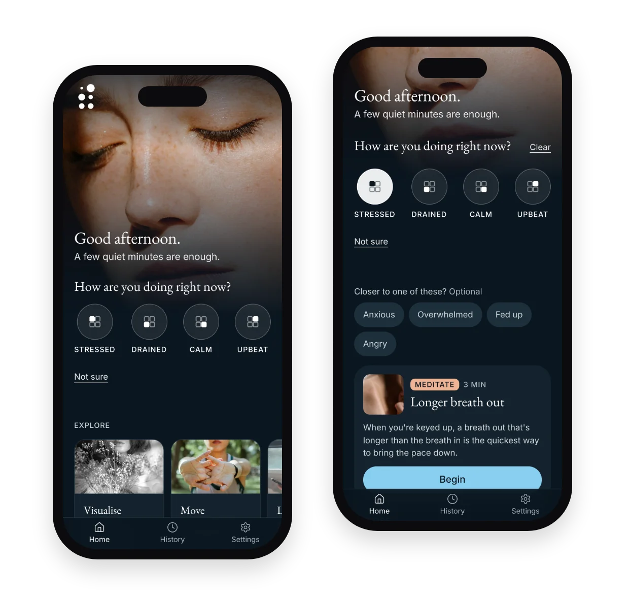
The same check-in, one tap from your Home Screen.
Until then, it installs from Safari. Open gentleview.ca, tap Share, then Add to Home Screen. It opens full screen, and Home, Meditate, Doodle, History and Settings work offline.
10 · What's next
Do the half I skipped.
Discover and Define
Interviews before more features. The problem statement is still a hypothesis.
Run the test plan
Five to seven sessions, then fix what they find and test again.
Claim only what testing shows
Not "reduces anxiety", not "clinically proven", not "therapy". Designed to support everyday regulation.